Creating a Dark Mode Feature for your React/Next.js Application with Tailwind CSS
An easy and efficient way to implement dark mode in React applications
Out of the many different features that your web application or website has or might have, having a dark mode feature is a must in today's digital landscape. Dark mode enhances user experience and makes your website appealing for the user who prefers a darker visual aesthetic. Not only is it a trend, but it also makes your website more accessible to all users.
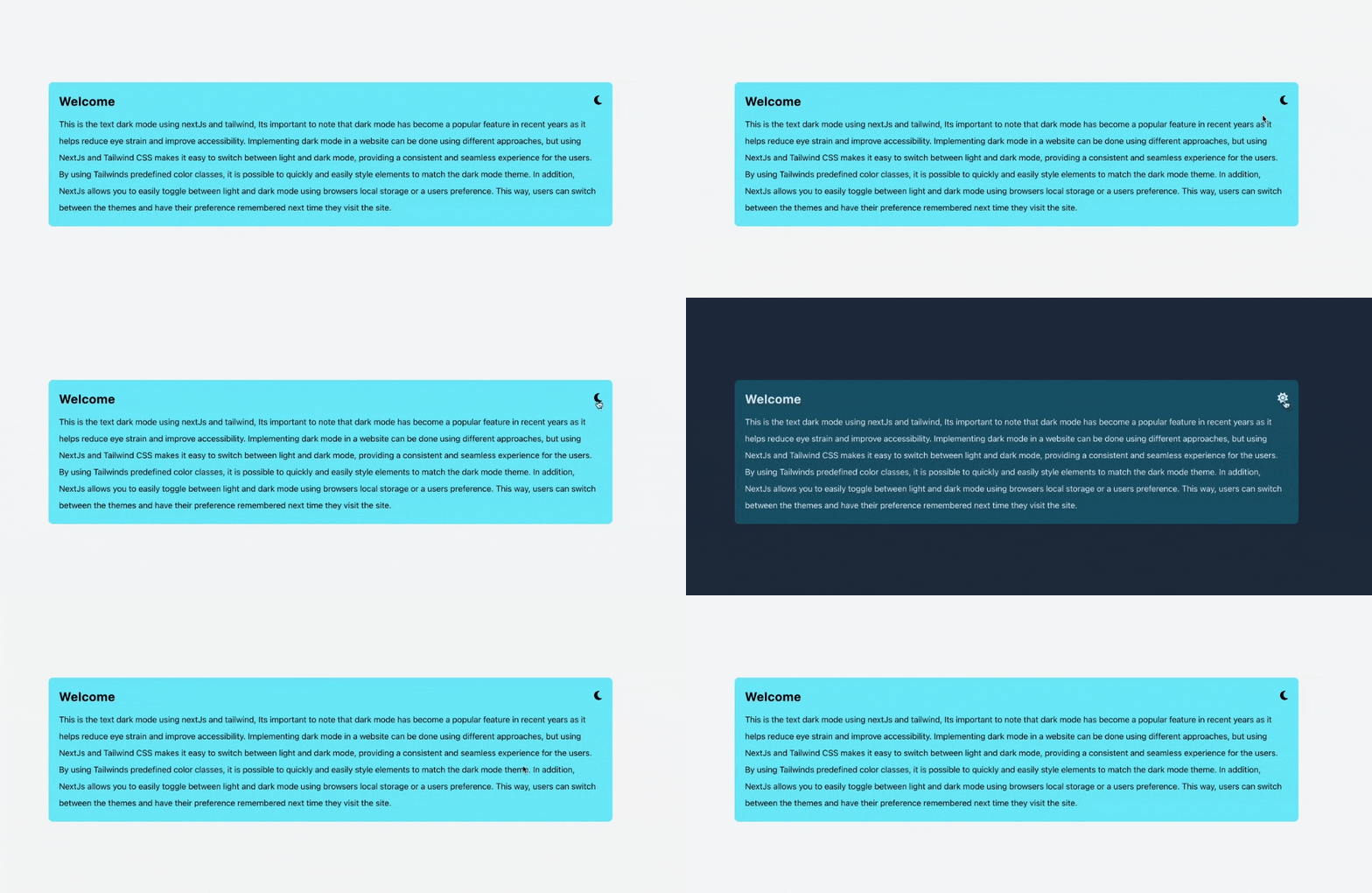
Hence, In this blog post, we will explore how to implement dark mode in your web application or website using the popular CSS framework Tailwind CSS and React or NextJS application. We will walk through the process of setting up React with Tailwind CSS and customizing dark mode to match your website's aesthetic and provide a seamless experience for your users.
While taking you through the process of setting up dark mode in your React application using Tailwind CSS and Vite, we'll be covering the following steps:
Setting up a React application using Vite, a development tool that makes it easy to get started with React.
Installing Tailwind CSS in React application, which provides a powerful set of pre-defined CSS classes that can be used to quickly and easily style elements.
Using Tailwind's built-in dark mode classes to create a consistent and seamless experience for users.
Adding a light and dark mode toggle in React application to allow users to switch between the two modes and have their preference remembered the next time they visit the site.
Note: This guide will provide brief details on how you can set up Tailwind with React, but for more details on how to achieve the same with Next.js, a link to a separate guide will be provided to assist you.
So, let's begin.
Setting up a React application using Vite
Vite is an extremely fast development tool for web projects which focuses on speed and performance with a focus on development experience. To set up your React application using Vite, follow the steps below:
Install Vite
npm i vite -gSetup React
npm create vite@latest react-tailwind-darkmode --template reactAnd done. This should create a react app for you. In order to set up NextJS app, you can follow this link.
Installing & Setup TailwindCSS
In order to install and setup TailwindCSS in your React or NextJS app, follow the steps below:
Install Tailwind CSS
 cd react-tailwind-darkmode/ # go to project directory
 npm install -D tailwindcss postcss autoprefixer # dependency
 npx tailwindcss init -p # init tailwind config
Setup Tailwind CSS
After installing the Tailwind CSS in step 1, a couple of config files,
tailwind.configandpostcss.configshould be generated. Go to thetailwind.configfile and update it as follow:// tailwind.config.js /** @type {import('tailwindcss').Config} */ module.exports = { // note: For NextJS it should be different path, depending upon where your pages and components sits. For eg: // content: ['./src/pages/**/*.{js,ts,jsx,tsx}', './src/components/**/*.{js,ts,jsx,tsx}'], content: [ "./index.html", "./src/**/*.{js,ts,jsx,tsx}", ], theme: {}, plugins: [], }Finally, put the
@tailwinddirectives for Tailwind's layer to./src/index.cssorglobals.css(if you're using NextJS) file like this:/* ./src/index.css for ReactJS app */ /* globals.css for NextJS app */ @tailwind base; @tailwind components; @tailwind utilities;
Tailwind built-in Darkmode class
Tailwind CSS makes it easy to integrate dark mode into your website by providing a dark variant to style elements differently when dark mode is enabled.
For example, the div below will show a background purple when the dark mode is enabled and will show a background white when the dark mode is enabled.
<div class="bg-white dark:bg-purple-700">
   ..... content or other HTML goes here ....
</div>
But how can a user switch between dark mode and light mode?
Good question! For that let's dive into another section.
Adding Light and Dark Mode Toggle
By default, Tailwind CSS uses the user's operating system (OS) theme mode to determine whether to display the light or dark mode version of your website. This means that if the user has set their OS theme to dark mode, the website will automatically switch to the dark mode version when using Tailwind CSS classes. For example, if the website uses the class dark:bg-purple-700, this class will apply a purple background color when the OS theme mode is set to dark. Similarly, if the user has set their OS theme to light mode, the website will automatically switch to the light mode version when using Tailwind CSS classes.
However, this may not always provide the best possible user experience. To give your users more control over their browsing experience, you may want to add a toggle button to your website that allows them to switch between light and dark modes.
In order to do that, follow the steps outlined in this guide. It will walk you through the process of adding a toggle button and creating a consistent and seamless experience for your users.
By adding this toggle button, you can give your users the flexibility to switch between the theme modes as per their preference which will give them a better user experience.
Add
darkmode: classto your tailwind config. Thedarkmode: classimplies your tailwind that the dark mode or simply dark variant classes will only be applied whenever the classdarkis present in the HTML tree.// tailwind.config.js module.exports = { darkMode: 'class', //... your other config .... }Add a toggle button to your page or components. The toggle button will have the action to let the user switch between light and dark mode and can be represented using icons or text. In this example, we'll be using a FontAwesome icon to represent the toggle process.
 const theme = useState('')
 return {
     <button
       className="theme-toggle dark:text-slate-200 text-xl"
       onClick={toggleTheme}
     >
       {theme === "dark" ? (
         <FontAwesomeIcon icon={faSun} />
       ) : (
         <FontAwesomeIcon icon={faMoon} />
       )}
     </button>
 }
Once the toggle button is in place, you should add an action to it that allows the user to switch between light and dark modes. In this example, we'll be naming this action
toggleThemefunction toggleTheme() { if (theme === 'light') { // if current theme == light setTheme('dark'); document.documentElement.classList.add('dark'); } else { // if current theme == dark setTheme('light'); document.documentElement.classList.remove('dark'); } }Only adding the toggle theme action is not enough because once when the user sets his theme on your website and visits it again, then it will forget what theme the user had set the last time when they visited. In order to maintain a better user experience, the website should remember the user's preference. Therefore, to solve this we will have to store the user preference in the localStorage of the browser. This way, when the user visits the website again, the website will retrieve the user's preference from the local storage and apply it automatically.
 const [theme, setTheme] = useState(""); // you can set default theme value here like useState("light")

 // we have to use useEffect so that to access localStorage
 // theme value when the website loads for the first time
 useEffect(() => {
   const theme = JSON.parse(localStorage.getItem("theme"));
   if (
     (!theme) ||
     theme === "dark"
   ) {
     setTheme("dark");
     document.documentElement.classList.add("dark");
   } else {
     setTheme("light");
     document.documentElement.classList.remove("dark");
   }
 }, [theme]);

 // toggle theme
 function toggleTheme() {
   if (theme === "light") {
     // when theme is changed, set the localStorage
     localStorage.setItem("theme", JSON.stringify("dark"));
     setTheme("dark");
     document.documentElement.classList.add("dark");
   } else {
     // when theme is changed, set the localStorage
     localStorage.setItem("theme", JSON.stringify("light"));
     setTheme("light");
     document.documentElement.classList.remove("dark");
   }
 }
Another way to enhance user experience is by setting the default theme to be the user's operating system (OS) theme until it is set by the user on the website. This can be achieved by making a slight change to the
useEffectcode.// for dark mode useEffect(() => { const theme = JSON.parse(localStorage.getItem('theme')); // if not theme and user OS is dark mode if ((!theme && window.matchMedia('(prefers-color-scheme: dark)').matches) || theme === 'dark') { setTheme('dark'); document.documentElement.classList.add('dark'); } else { setTheme('light'); document.documentElement.classList.remove('dark'); } }, [theme]);By setting the default theme to the user's OS theme, you can provide a more consistent browsing experience for your users, as their preferred theme will automatically be applied on their first visit.
And that's it! With these steps, you've now added a dark mode feature to your website. You can also find the code for the dark mode that I wrote in the Github repository here.
Conclusion
In this article, we discussed how you can create a dark mode feature for your website or web application using Tailwind CSS in React or Next JS application. We covered how to set up your React application, how to install and set up Tailwind CSS, how to use the built-in light and dark mode classes, and how to add a toggle button to allow users to switch between light and dark mode. We also discussed how to store the user's preference in the browser's local storage to provide a more consistent and enjoyable browsing experience for your users. By following these steps, you can create a dark mode feature that improves accessibility and user experience on your website.
Finally, If you found this article useful, please consider sharing it with your friends and colleagues. If you have any questions or want to discuss anything related to the topic, please feel free to reach out to me on Twitter or LinkedIn, I would be happy to chat with you.
Thank you for reading.


